Drupal Community Article
Naming Conventions for Drupal Image Styles: Inspired by Utility-Based Systems like TailwindCSS and Bootstrap
Naming Conventions for Drupal Image Styles
"Favor composition over inheritance" — Sarah Dayan
Utility-first naming
Have you ever found yourself overwhelmed by the sheer number of image styles in a Drupal project? As developers, managing a large number of image styles can get tricky, especially when each layout or design tweak demands a new style. Surprisingly, a utility-based naming convention, like those used in TailwindCSS and Bootstrap, might hold the solution to organizing these styles efficiently. In this article, we’ll explore how adopting a structured, utility-based approach can simplify the process, making your Drupal image styles easier to maintain and scale.
Utility-first naming
Traditional naming
The Problem with Traditional Image-Style Naming
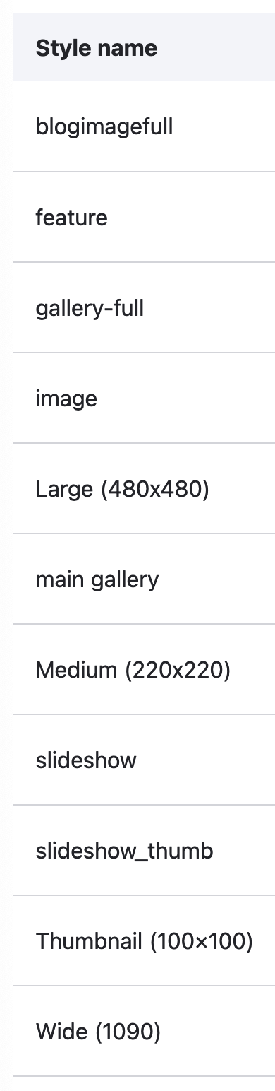
Drupal's flexibility in defining image styles is a powerful feature, but it often leads to a cluttered and disorganized list of styles. The usual practice is to name styles based on their dimensions or content context, such as “blog-thumbnail-150x150” or “hero-banner-1920x600.” While this method works initially, it can spiral into chaos as your project grows. You might find yourself creating multiple versions of similar styles or forgetting which one fits a particular layout.
For instance, consider this scenario: you need different image sizes for various layouts—two-column grids, full-width sections, and mobile devices. Without a consistent naming strategy, your list of image styles could balloon, and managing updates or finding the correct style becomes tedious.
Why Utility-Based Naming Makes Sense
Utility-based frameworks like TailwindCSS and
Bootstrap are known for their clear, concise class names that describe exactly what they do. For example, in TailwindCSS, classes like
w-1/2 or
h-full directly indicate width and height properties. This method provides clarity and reduces redundancy in code.
Applying a similar convention to Drupal image styles means focusing on descriptive yet flexible names. Instead of using a vague or overly specific name like “article-image-large,” a more utility-based approach might be something like
img-12-col, img-2-col, or
img-4-col, emphasizing the image’s width relative to its container.
Crafting a Utility-Based Image Style System
To implement this in Drupal, we can borrow principles from utility-first frameworks and create a structured system for naming image styles. Here’s how:
1. Define a Base System
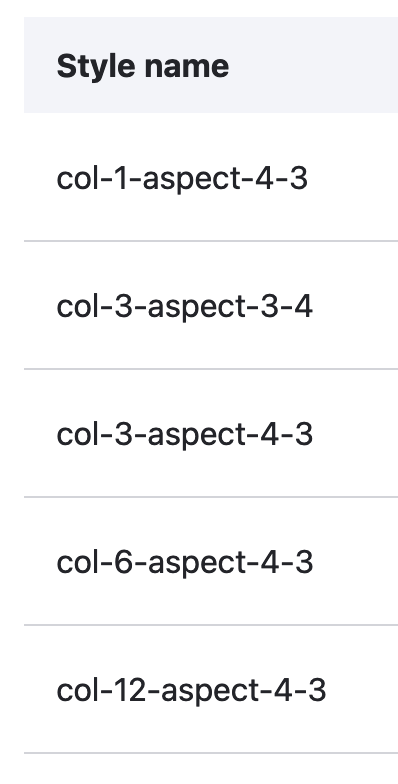
Start by defining a base set of image sizes corresponding to your layout’s grid system. If you're using a 12-column grid, for example, create base styles like:
img-12-col: Full width of the container.img-6-col: Half the width of the container.img-4-col: One-third the width of the container.img-2-col: One-sixth the width of the container.
These styles should maintain the original image height while scaling the width proportionally.
2. Consider Aspect Ratios
Image aspect ratios are critical for maintaining visual consistency across different devices and layouts. Create styles that incorporate common aspect ratios like 16:9, 4:3, or 1:1. For instance:
img-16-9: Images with a 16:9 aspect ratio.img-1-1: Square images.img-4-3: Images with a 4:3 aspect ratio.
These styles can work in conjunction with your width-based styles, allowing for more flexibility and control.
3. Device-Specific Styles
In a mobile-first world, responsive design is essential. Create responsive image styles that adjust based on device size:
img-md-6-col: For medium devices, this image takes up 6 columns.img-lg-12-col: For large devices, this image takes up the full width.
By incorporating device-specific prefixes, you can ensure that images look great on any screen size.
4. Leverage Automation
With a structured naming system in place, automation tools can further streamline the process. Instead of manually creating and maintaining numerous image styles, you can use the Easy Responsive Images module in Drupal to automate the process of generating responsive image styles based on predefined rules. This module allows you to set up image style variations quickly and ensures that images adjust dynamically based on the device size and layout.
You can find more information on the Easy Responsive Images module here: Drupal module: Easy Responsive Images
5. Less is more
If you combine all variations of aspect ratios, the base system, and device-specific styles, you could easily end up with tens or even hundreds of image styles. This would bring you back to the original problem of managing too many styles. Instead, start with a minimal set of styles that cover the most common use cases, and only add new styles when absolutely necessary.
Real-World Examples
Let’s take a practical example of how utility-based naming works in a typical Drupal setup. Imagine you're building a portfolio site that features images in a grid. You could create the following image styles based on a 12-column grid system:
- Full-width hero image:
img-12-col-aspect-16-9 - Portfolio grid image (one-third width):
img-4-col-aspect-4-3 - Thumbnail images:
img-2-col-aspect-4-3
By combining a utility-based naming convention with aspect ratios, you can quickly create clear, reusable image styles that adapt to different layouts and devices
Human Impact: Managing Complex Projects
A utility-based naming convention doesn’t just benefit developers—it also has a tangible impact on project management. Imagine a scenario where a project is handed over to a new team. With dozens of poorly named image styles, onboarding becomes a nightmare. However, by adopting a clear and logical naming system, new developers can easily understand and manage the project without confusion.
In large-scale projects, this clarity can save hours of development time, reduce errors, and enhance collaboration across teams.
Final Thoughts and Looking Ahead
As you move forward with your Drupal projects, consider how a utility-based naming approach can help streamline your processes, reduce clutter, and make your site easier to manage. What other aspects of your development workflow could benefit from this kind of utility-first thinking?